Putting to a vote

Dusty

Well-known member
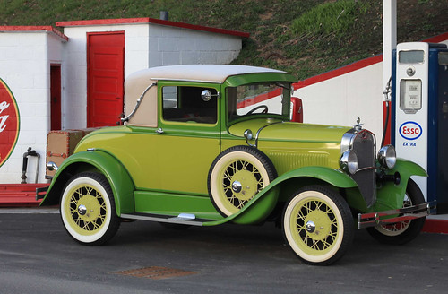
My wheels are in need of a paint job, the wheels now are a cream color. I have thought about going with the green that is on the main part of the body or a straw yellow for the wheels or keeping them the cream color. The following is a rough mock up of what the wheels might look like. What should I go with.

thanks
dusty

the way they are now
4586167221_83559919ae.jpg

the green
4833084258_e24a01ded3.jpg

the yellow
4832474685_3667b4d101.jpg
 
As a designer, I can offer color theory and some subliminals. There is a fundamental thought in design that is this: If you emphasize everything, you have enphasized nothing. I believe there is too much competition of color using the yellow. If you had to choose, what part of your car do you want to stand out most? I actually really like the yellow, but my eye keeps going to the wheels. Is that where you want people to look frequently? Bright yellow draws a lot of attention, like as in a fire engine color.

I suggest against the green. It is too much green in my opinion. (This is just an opinion, not a design theory thing).

The straw is nice because it is different, but it doesn't scream 'look at me'.

Personally, I'd go with black (I think). It will, by the above principal, really make the body of your car pop. Id try a mockup of that and see what you think.

my 2 cents. Good work doing the mockup. It really allows you to make a good decision, which in the end, the winning answer should be what you like best, regardless of color theory.

Tom
 
Just a thought, but you might try a very dark green, darker than all the rest? This would take a backseat to your cars body, but still be in the green theme. If this were an advertisement, I would probably introduce a darker green, quite dark like a hunter or something with the same qualities as your other greens so it goes with them.
 
IMO, go with natural (light brown) wood spokes. But since you already have the wires, cream.
 
As a designer, I can offer color theory and some subliminals. There is a fundamental thought in design that is this: If you emphasize everything, you have enphasized nothing. I believe there is too much competition of color using the yellow. If you had to choose, what part of your car do you want to stand out most? I actually really like the yellow, but my eye keeps going to the wheels. Is that where you want people to look frequently? Bright yellow draws a lot of attention, like as in a fire engine color.

I suggest against the green. It is too much green in my opinion. (This is just an opinion, not a design theory thing).

The straw is nice because it is different, but it doesn't scream 'look at me'.

Personally, I'd go with black (I think). It will, by the above principal, really make the body of your car pop. Id try a mockup of that and see what you think.

my 2 cents. Good work doing the mockup. It really allows you to make a good decision, which in the end, the winning answer should be what you like best, regardless of color theory.

Tom
Thanks Tom for your thoughts, I am a little confused because you said the yellow would be too bright but you also said the straw was nice :confused: the straw color is the yellow, the picture does over do the yellow as I wanted to show it in a realistic sense. I would use the stock straw color that is available and I don’t think it would be quite that bright. I will also do a mock up in the darker green and see what that looks like.

Thanks
dusty
 
I would agree that black or a darker green would be something worth seeing in a mock up.

My Balsam Green/Valley Green 1929 Phaeton looked nice with Cream wheels. When I switched to black wheels, the car looked much better. The darker wheels don't draw as much attention and the car looks sharper.

But, it is your car and go with what makes you happy!
 
As a designer, I can offer color theory and some subliminals. There is a fundamental thought in design that is this: If you emphasize everything, you have enphasized nothing. I believe there is too much competition of color using the yellow. If you had to choose, what part of your car do you want to stand out most? I actually really like the yellow, but my eye keeps going to the wheels. Is that where you want people to look frequently? Bright yellow draws a lot of attention, like as in a fire engine color.

I suggest against the green. It is too much green in my opinion. (This is just an opinion, not a design theory thing).

The straw is nice because it is different, but it doesn't scream 'look at me'.

Personally, I'd go with black (I think). It will, by the above principal, really make the body of your car pop. Id try a mockup of that and see what you think.

my 2 cents. Good work doing the mockup. It really allows you to make a good decision, which in the end, the winning answer should be what you like best, regardless of color theory.

Tom

Excellent breakdown Tom. Personally I find it difficult at times to define in words what we actually see and you did it well. Your statement "The straw is nice because it is different, but it doesn't scream 'look at me'." was too soft however assuming you meant it disappears with the surrounding colors. In my opinion DARKER would be better.
 
Yes, quick clarification, straw and yellow have different effects. It has a technical breakdown, but in lay terms basically, straw, while still a light yellow, will do a better job supporting the body color because it is less bold and bright (less attracting of attention). Bright yellow will tend to really draw attention because of it's actual color (hue) and in doing so, it competes with the other colors for attention, making your eyes bounce around from color to color.

A simple example is that you see a lot of bright yellow fire engines, but no straw colored ones. That is because they need to be seen quickly and easily and the eye is drawn towards them. ALL OF THIS having been said, I would lean towards a darker color, but would have to see it first.

Is it photoshop you are using? One of my daily tools which is a computer photo manipulation program. Tom
 
Since you asked, I like the car colors, but of course they're not stock colors. I hate cream wheels with whitewalls--on any car. The whole point of whitewalls is contrast, and there's almost no contrast with cream wheels. I'd mock up black or a darker version of the car's green.
 
Despite all the discussion about hue, saturation, value, and the rest of the pro designer jargon (which is part of my day job too), you have a really decently restored Model A. If you're not going to repaint the whole car to something more traditional and authentic, then there's nothing really wrong with the color of the wheels the way they are. The black suggestion is one good alternative, but otherwise, just drive the car and enjoy the smiles you get from the sidewalks.
 
Yes, quick clarification, straw and yellow have different effects. It has a technical breakdown, but in lay terms basically, straw, while still a light yellow, will do a better job supporting the body color because it is less bold and bright (less attracting of attention). Bright yellow will tend to really draw attention because of it's actual color (hue) and in doing so, it competes with the other colors for attention, making your eyes bounce around from color to color.

A simple example is that you see a lot of bright yellow fire engines, but no straw colored ones. That is because they need to be seen quickly and easily and the eye is drawn towards them. ALL OF THIS having been said, I would lean towards a darker color, but would have to see it first.

Is it photoshop you are using? One of my daily tools which is a computer photo manipulation program. Tom

Tom, the intent was to go with the straw colored wheels, I over did the bright yellow just to show the difference between it and the lighter green. The straw was so close to the green that I did not think it showed a true representation. Yep I am using photoshop, it is an amazing program that I have probably only learned 10% of what it is capable of doing.

dusty
 
Back
Top